Back
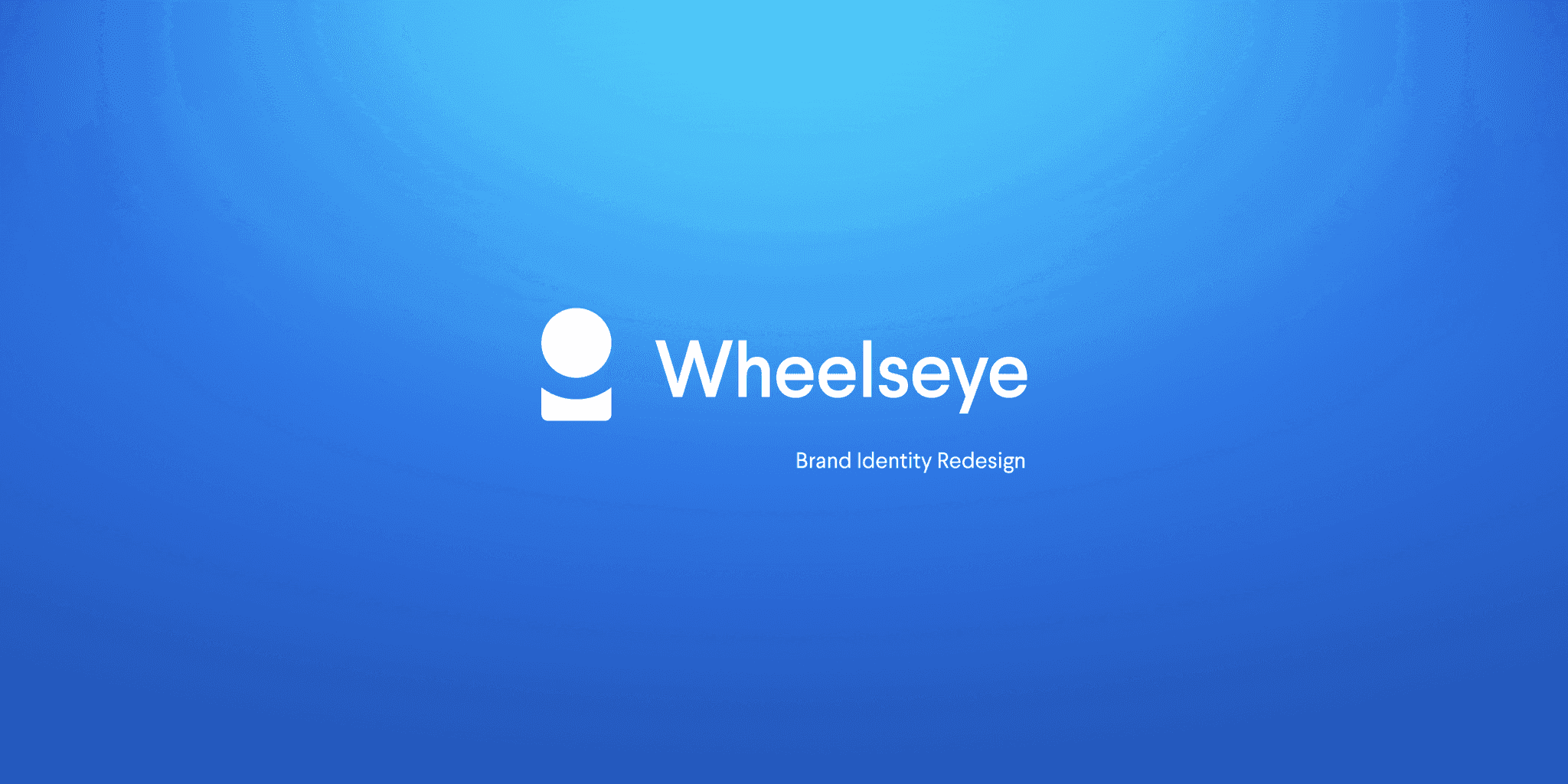
Wheelseye Brand Identity Redesign
2 min read
PUBLISHED ON
10 january 2021
Wheelseye Brand Identity Redesign
case study cover
img
MY ROLE
Logo Design, Branding
TIMELINE
April 2020 to May 2020
OVERVIEW
Wheelseye is a SAAS-based startup that fundamentally supports the logistics industry, specifically the operators—individuals who own a fleet of trucks. Wheelseye achieves this by offering them visibility into their trucks, connecting them with the appropriate shippers, and facilitating easier management of transactions and FasTag recharges through a virtual wallet.
They plays a crucial role in fostering the growth of the logistics ecosystem and enhancing the efficiency of the demand-supply flow for mutual benefit.
Reason for Redesign
Wheelseye is experiencing exponential growth, with a strategic focus on expansion and establishing a strong foundation. Having reached a suitable platform and gained visibility in the market, there is now a need for branding and developing a distinctive visual identity for the company.

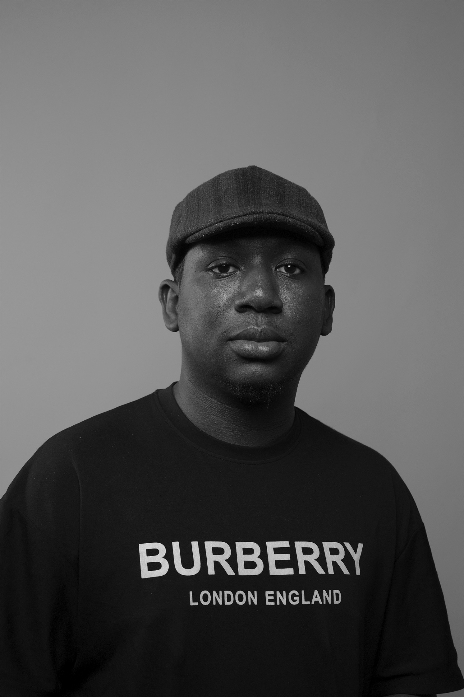
Truck Driver with Wheelseye Tshirt
img
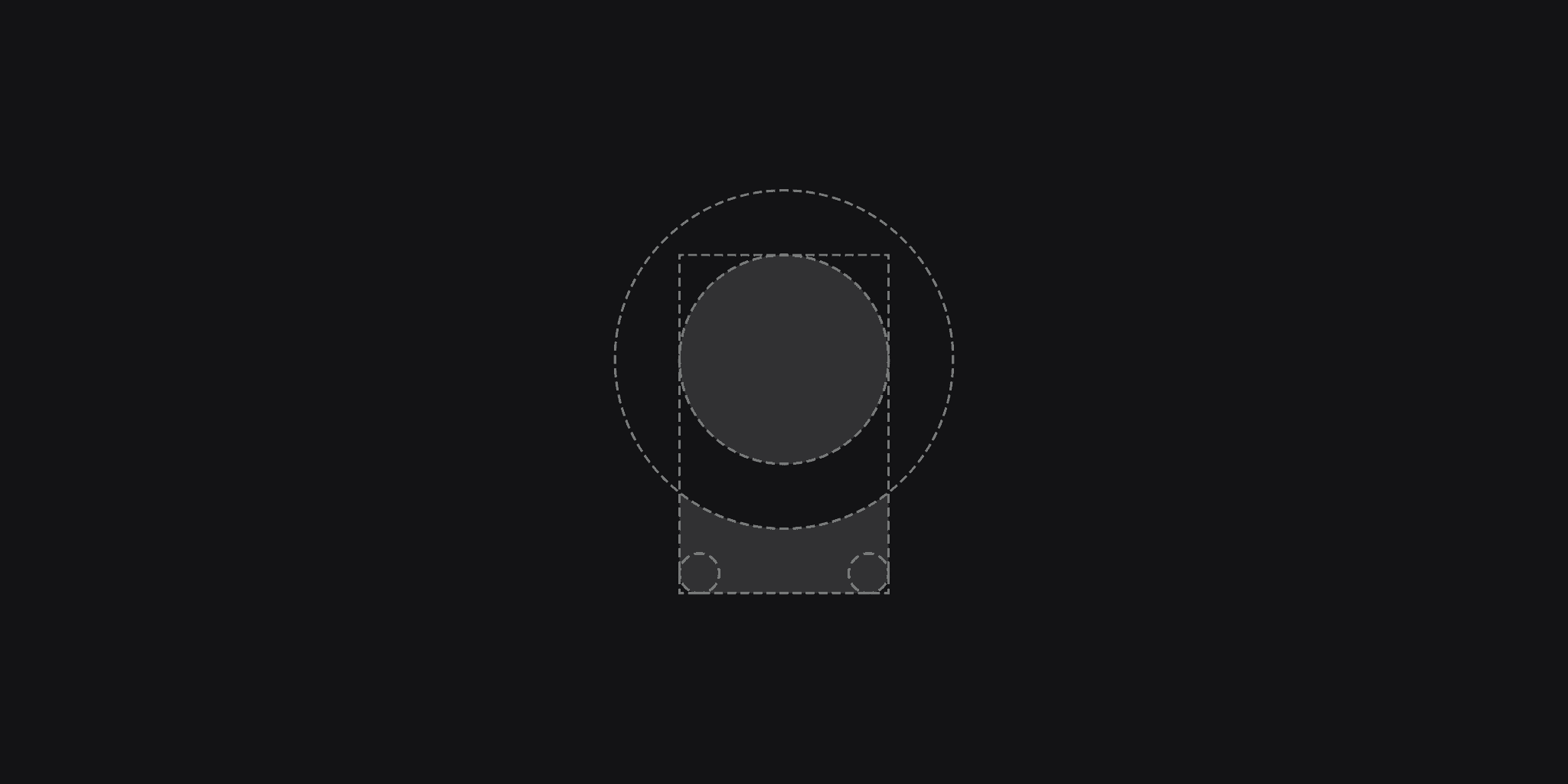
Logo Construction
The logo is crafted using simple shapes, mainly intersecting circles and a rectangle in the golden ratio, ensuring optimal proportions. This design choice aims to preserve distinctive features while ensuring flawless legibility across all sizes and applications.

Logo Construction
img
Logo Mark
img
Concept
The logo mark is abstract and holds a philosophical meaning. Envisioned in three dimensions, it resembles a sphere on a track. The sphere symbolizes the logistics community, suspended above the track, illustrating a reduction in friction within the industry. The curved track underneath complements the weightiness of the sphere, symbolizing the support provided by Wheelseye, guiding it in a specific direction. The cross-section of this integrated system forms the final logo.

Logo Iterations
img
Colours
Primary Colours
The essence of trust and security is what we aim to convey through our services and products. We have consistently employed shades of blue in our mobile and web interfaces, and we intend to maintain this color scheme for a cohesive and enduring connection with our customers.
Secondary Colours
Our secondary colors draw inspiration from transportation hues. It's recommended to use them judiciously in illustrations, photography, and products to preserve their significance and impact.

Colour Palette
img
Wheelseye Mobile App Screens

Login Screen
img
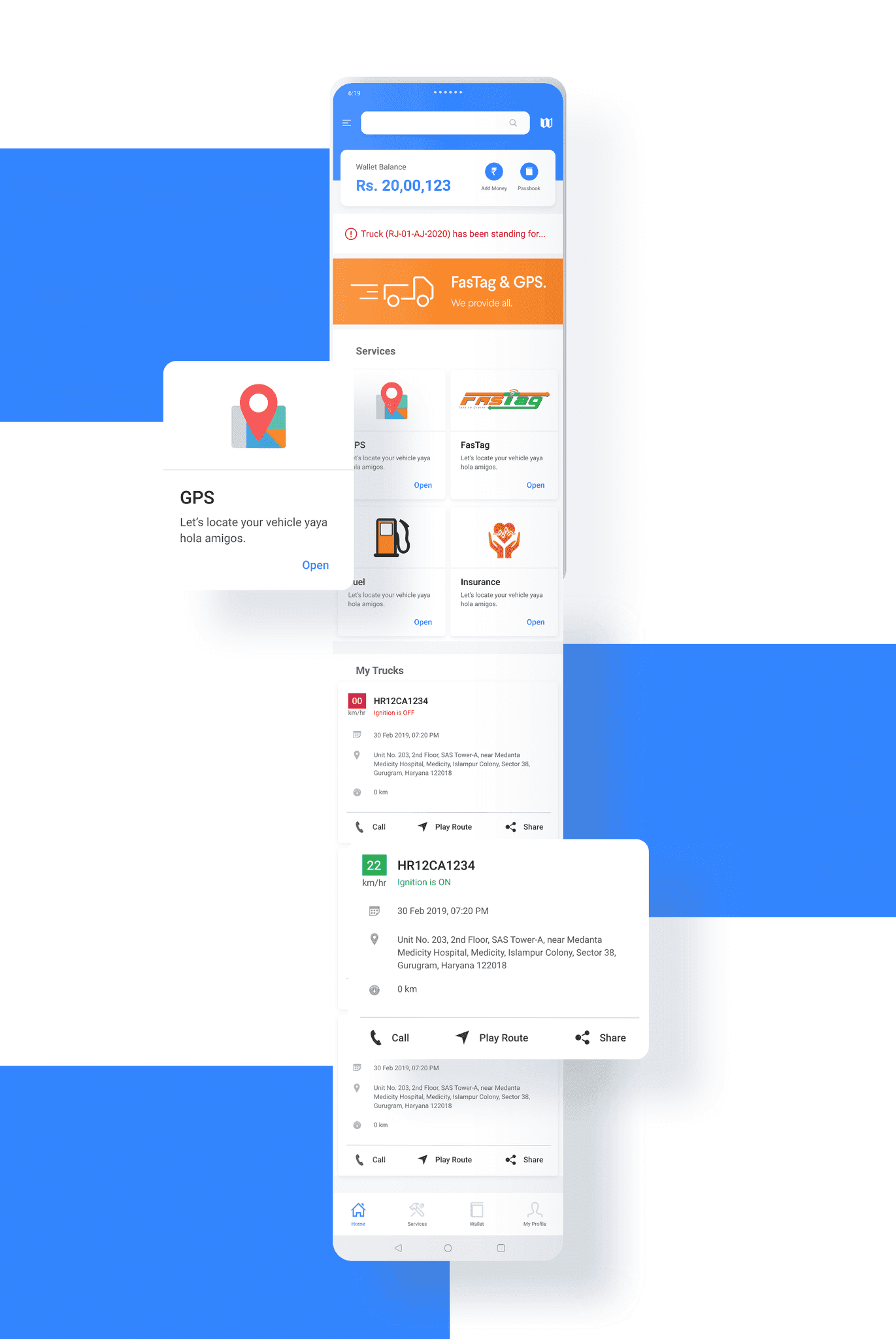
Home Screen
img
Mockups

Logo Interpretation
img

Advertisement
img
Retrospection
I thoroughly enjoyed the entire process, as it was my first time engaging in such an activity. Tonmoy Phukan and Vaibhav Rawat, fellow Product Designers, graciously participated in this little project of mine, offering feedback and guiding me at every step. Being one of my initial works as a designer, it proved to be a valuable learning experience. Thank you!
More Projects

2023
3D & INTERACTION DESIGN
Badges

2022
Character Design
Furmojis
CONTENTS
Overview
Reasons for Redesign
Logo Construction
Concept
Colours
App Screens
Mockups
Retrospection
Adedoyin
Visual Designer
Creations
Home
Work
Personal Projects
Creative Suite
socials
12.9716° N, 77.5946° E